N.E.S.T. User Guide
Access: nest.thephenom.app – requires a Cognito account in the phenom-prod pool with membership in the nest-access group. Contact an administrator to request access.
1. Signing In & Health Check
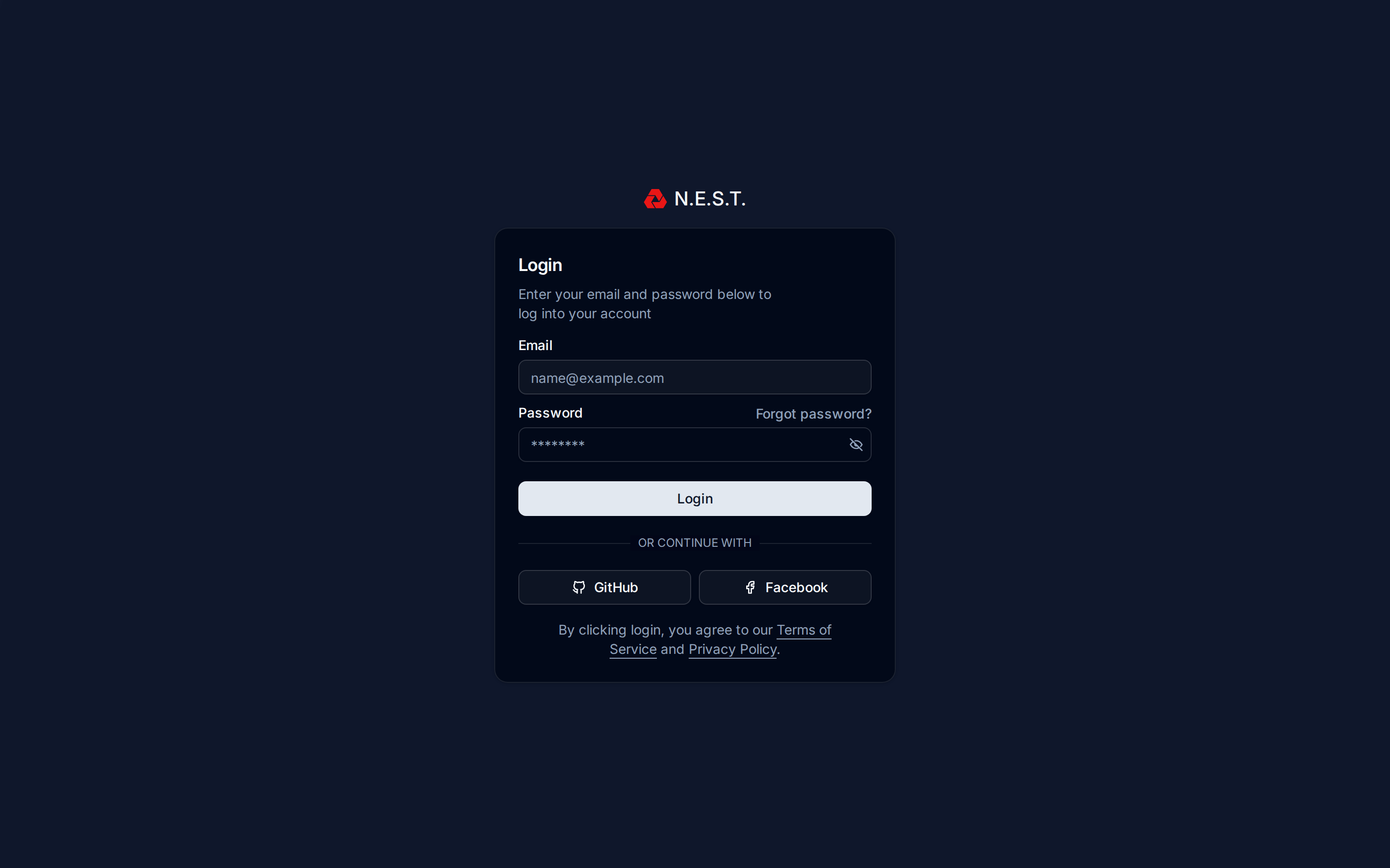
N.E.S.T. uses AWS Cognito for authentication. Navigate to nest.thephenom.app and sign in with your email and password.
Your account must be provisioned in the phenom-prod Cognito pool and added to the nest-access group. If you see “Your account is not authorized to access N.E.S.T.”, contact an administrator – your account exists but the nest-access group membership is missing.
If you were previously signed in and see a Chat authentication failed error, use the Sign out and reset chat option in your avatar dropdown to clear stale Matrix session state and re-authenticate. See Section 19 for details.
After Sign-In: Health Dashboard
Once your credentials are accepted, N.E.S.T. routes you through a brief Health Dashboard before opening the main 3D globe. This screen runs live checks against the platform’s core services (Cognito, Nest API, Phenom Events, Chat Server, Globe Assets, Scene Assets) and shows the result inline.
Behavior:
- All systems operational: the screen shows “All systems operational” and auto-proceeds to the main dashboard after 2 seconds.
- One or more failures: checks pause. You see a status grid, a Refresh button to re-run checks, a Submit Issue button (opens a pre-filled GitHub issue with your identity, geo, and per-service latency/error data), and a Proceed to Dashboard button to continue anyway.
The health gate runs after authentication, so any issue you submit from this screen is automatically tagged with your Cognito identity; no need to type it manually.
If N.E.S.T. ever shows the “Oops! Something went wrong” (500) screen, it now offers Copy crash details and 🐛 Report crash on GitHub – the latter opens a pre-filled issue containing the error, stack trace, your URL/browser, and a tail of the recent console log (the full log is on the clipboard via Copy). This lets us troubleshoot a crash from your account without you needing the browser console.
2. Dashboard Overview (3D Globe)
The main dashboard is a native MapLibre 3D globe (Esri World Imagery basemap) showing every located Phenom event. It replaced the retired Cesium/SitRec globe: MapLibre is lighter (it no longer crashes iOS), keeps markers and sightlines glued to their GPS coordinates at any zoom or tilt, and supports real 3D terrain + buildings.
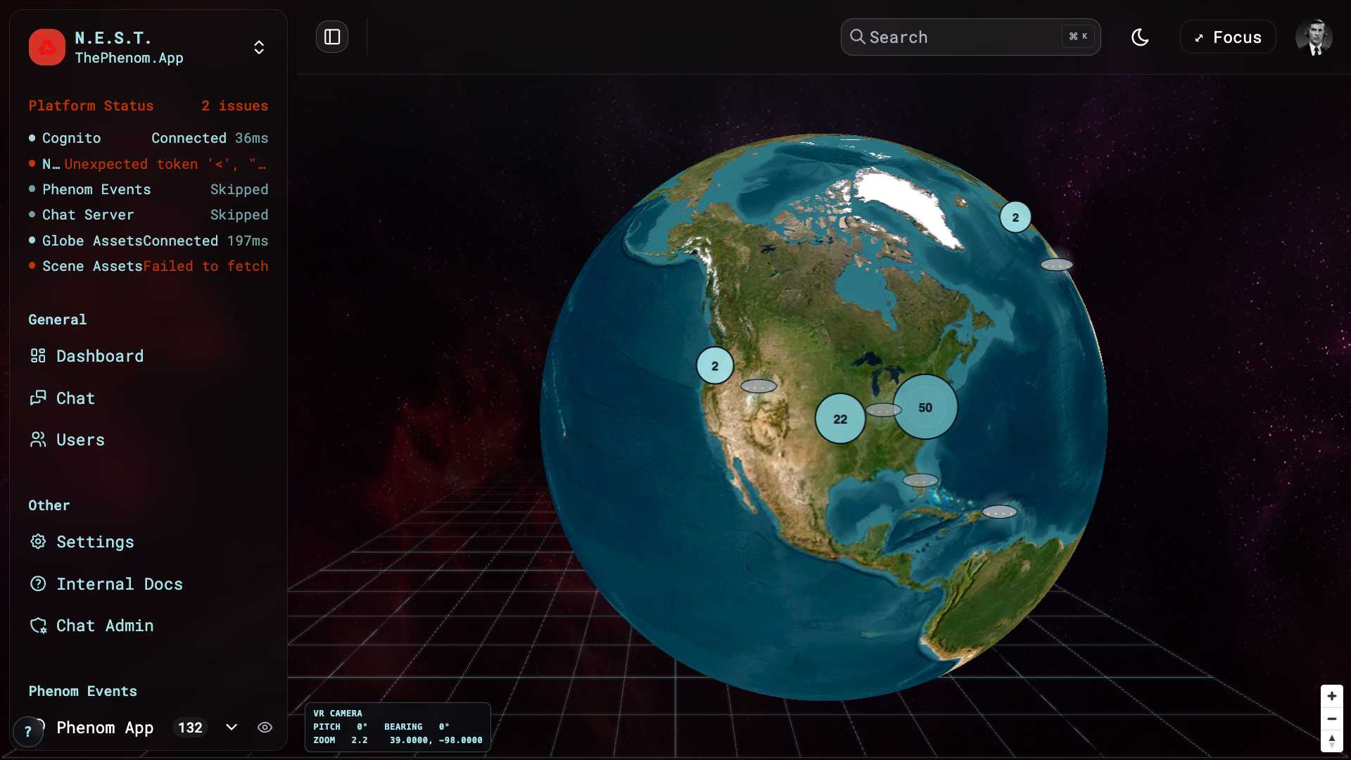
What you see
| Element | Location | Description |
|---|---|---|
| Sidebar | Left | Navigation + the Phenom Events list; collapsible. The dev-nest build shows a black square with a throbbing red Phenom mark (so it’s never mistaken for production). |
| Header | Top | Search (Cmd/Ctrl+K), light/dark toggle, Focus button, profile avatar |
| 3D Globe | Center | Esri satellite imagery; descend over a city for 3D terrain relief + extruded buildings |
| VR-camera HUD | Bottom-left | Live pitch / bearing / zoom / lat-lng of the globe camera |
| Navigation controls | Bottom-right | Zoom +/- and compass (drag to spin, right-drag / two-finger to tilt) |
Interacting with the globe
- Spin: drag. Tilt: right-drag (or two-finger drag). Zoom: scroll, or the +/- controls.
- 3D terrain + buildings: zoom to street level (≈ z15+) over a populated area – terrain relief and extruded OpenStreetMap buildings appear over the satellite imagery (free sources, no API key).
- Focus mode: the header ⤢ Focus button hides the header chrome and collapses the sidebar for a clean globe + media-player-only view; a floating ⤢ EXIT FOCUS button restores everything.
- Auto-orient to your location: on first load the globe flies to your device’s GPS position (one time, when no event is selected). If you deny location permission it stays on the default view. Aircraft (§9) populate around the covered regions.
Markers, clusters & sightlines
Each event renders as a UFO icon. Markers and clusters convey information at a glance:
- Newest event pulses with a cyan radar ping.
- Age drives intensity – recent sightings are bright, older ones fade (intensity is inversely proportional to age).
- Bearing sightline: a purple beam points along the recorded compass heading; its length scales 1–5 with the clip’s duration (longer clip → longer beam). Sightlines appear once you zoom in past the cluster zoom.
- Clusters show a count bubble (size + colour step up with the number of events):
- Single-click a cluster → it spiderfies: members fan out as UFO leaves with usernames. Click again, or click empty space, to collapse.
- Double-click a cluster → the map zooms in to reveal its sub-clusters.
- Single-click a UFO (a lone marker or a spider leaf) → the camera flies (≈2 s) into the recorded observer pose, opens the media player, and drops you into first-person Streetview (see §2a).
2a. Recreating a sighting – Streetview
Selecting an event enters Streetview: a first-person Three.js scene with a free camera that has no pitch cap (the globe is limited to an 85° tilt, so it cannot look at the zenith – Streetview can). Everything is co-registered in one local horizontal frame so it matches the recorded orientation:
- Media frustum – a rectangular pyramid at the observer’s eye, its far face carrying the event’s video/image at the clip’s true aspect ratio, aimed along the recorded bearing + elevation. The bearing is corrected from magnetic to true north (WMM declination) so it lines up with the sky.
- Sky objects – Sun / Moon / planets / stars (astronomy-engine), satellites (SGP4/TLE), and aircraft (ADS-B, from the event’s embedded data and the cached historical archive) at their real alt-az positions.
- 3D terrain + buildings around the observer (OSM buildings, an elevation grid for ground relief).
Streetview tools (HUD):
| Tool | What it does |
|---|---|
| Metrics readout (top-right) | Event id, RECORDED bearing/elevation, MAG→TRUE declination, and any manual ALIGN nudge |
| ☰ / ✕ controls toggle | Show/hide the control panels (auto-collapsed on phones); ⟲ resets all panel positions |
| Layer toggles (bottom-left) | Media / Celestial / Satellites / Aircraft (Buildings + Terrain are always on) |
| MEDIA FRUSTUM panel | Image opacity slider (fade the frame to see sky objects behind it); ALIGN drag-to-re-aim (RECORDED vs ALIGNED + NUDGE metrics, with RESET) |
| SATELLITES panel | Size + brightness sliders |
| ✥ MOVE | Grab the ground and drag to reposition the observer (also WASD / arrow keys); live N/E offset + RECENTER |
| ‹ BACK TO GLOBE | Returns to the globe at the exact view you left; a STREETVIEW › button re-enters with the scene state preserved |
The media player’s metadata is a slide-down drawer that’s closed by default, so the media frame sits bare and lines up with the frustum; fading is done with the frustum’s image-opacity slider.
All HUD panels are draggable (grab the ⠿ grip) and their positions persist. Text size is configurable in Settings → Appearance (separate Streetview and Globe scales).
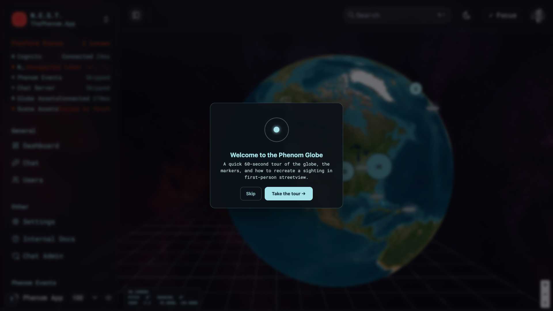
2b. Onboarding tour
On first visit a welcome card offers a guided tour (driver.js) that highlights the globe, the events list, the camera HUD, Focus mode, and the dev-build badge. Replay it anytime from the ? button (bottom-left) or Settings → Appearance → Replay onboarding tour.
3. Drops vs. Phenoms
N.E.S.T. handles two distinct kinds of content. They come from different places and carry very different data, so the app treats them differently end to end. Understanding the difference is essential.
Phenom Drops (red icon / amber accents)
A Drop is a media file (image or video) submitted by a user directly, with no accompanying sensor capture. It is unverified, user-supplied content: on upload it is scanned for viruses and for AI manipulation, and if it passes those checks the submitter is issued a badge they can use to prove they submitted the content.
| Attribute | Detail |
|---|---|
| What | A user-submitted media file (image or video). Unverified content, not captured through the Phenom App’s sensor pipeline. |
| On submission | Scanned for viruses and for AI manipulation. On pass, the submitter receives a verification badge proving they submitted the file. |
| Data | Filename, file type & size, content hash, AI-manipulation result, verification badge / proof links, GPS location (when present), and any nearby aircraft. |
| Color | Red paper-aeroplane icon in the events list; amber/orange accents on the Users-page charts and filters. |
| Playback | Appears in the Phenom Events list (Drops filter) and opens in the media card. Not placed on the globe and not recreatable in Streetview, because a Drop carries no observer sensor metadata. |
Phenom Events (cyan / sky-blue)
A Phenom Event is content created exclusively inside some version of the Phenom App (the Buzzard production app, its development build, or the newer PhenomApp). Crucially, the App records sensor data alongside the video (device orientation, motion and altitude), which backs up the footage and lets N.E.S.T. reconstruct where the camera was pointed.
| Attribute | Detail |
|---|---|
| What | Video captured in a Phenom App, with synchronised sensor data backing the footage. |
| Data | Owner, video, GPS, the captured sensor data (magnetometer / accelerometer / altitude), and nearby aircraft (ADS-B). |
| Color | Cyan / sky-blue UFO marker and badges. |
| Playback | Click the UFO marker to fly in, then drop into Streetview (camera frustum + sky), alongside the media player. Events with sensor data recreate the exact camera pose; location-only events fall back to a default skyward view. |
| Icon | Cyan UFO marker on the globe. |
Why only Phenom Events appear on the globe: the globe and Streetview recreate the observer’s view from the captured sensor metadata. Drops carry no such metadata, so there is nothing to recreate; they live in the list and media card only.
How to Tell Them Apart
In the Phenom Events list (All / Events / Drops filter), search results, and the Users page:
- Cyan UFO = a Phenom Event (Phenom App capture, sensor-backed)
- Red paper-aeroplane / amber accents = a Phenom Drop (user-submitted, scanned)
The Users page (see Section 13) shows separate stats and chart filters for each type.
4. The Sidebar & Phenom Events list
Browsing happens in the left sidebar plus a top-navbar EVENTS popover. The sidebar holds:
- Navigation – General: Dashboard (the globe), Search, Chat, Users · Other: Settings, Internal Docs, Chat Admin · plus INT-team links (Ops, Linear) when you’re in the INT group. Which top-level items show is configurable in Settings → Display.
- Platform Status – a live mini health readout (the same checks as the sign-in gate).
- My Lists – your named collections (see §11–§12), with + Create New List.
- Shared Lists – lists other people have shared with you (see §12), each with the originator’s avatar.
- Avatar (footer) – profile, shared-content badge, notifications, logout / reset-chat.
The whole sidebar uses the frosted-glass pane styling and collapses via the toggle at the top-left of the header.
The EVENTS popover (top navbar)
The Phenom Events list now lives in an expandable EVENTS item in the top navbar (right of the sidebar toggle) rather than in the sidebar. Open it for the scrollable list of events and drops:
- Each row shows the owner/username, the source icon (cyan UFO = Phenom Event, red paper-aeroplane = Drop), and a per-row visibility eye to hide/show that event’s marker on the globe.
- A filter box searches by filename, owner, email, file hash, or location; a show/hide all control toggles every marker.
- The All / Events / Drops facet filters by source; events are grouped (e.g. by category, with an Uncategorized facet for events that haven’t been categorised).
- Selecting a row flies the globe to that event and drops into Streetview (same as clicking its marker).
- Drag a row onto a list in the sidebar (My Lists) to add it to that collection.
The popover’s left edge sits flush with the sidebar’s right edge so the two panels don’t overlap.
5. The media player
Selecting a Phenom event opens a floating media player that shows the clip. It persists across the globe and Streetview (it’s the same instance, so its position carries between the two modes), and you can drag it anywhere.
| Control | How to use |
|---|---|
| Drag | Grab the header to move the player anywhere on screen |
| Play/Pause | Standard playback control |
| Speed | Cycle the playback rate (see §6) |
| Metadata drawer | The card opens collapsed (media-only) so the frame lines up with the Streetview frustum; the ⊕ / ⊖ toggle slides the metadata drawer (timestamp, location, owner, verification status, etc.) open/closed |
| Close | The X dismisses the player |
The old Vid / BG opacity sliders are gone – fading is now the Streetview frustum image-opacity slider (§7). Grab the bottom-right corner to resize the player.
6. Adjusting Playback Speed
Click the slow-motion icon (film reel) in the video player header to cycle through 7 speed presets:
| Speed | Use Case |
|---|---|
| 0.1x | Frame-by-frame analysis of fast-moving phenomena |
| 0.25x | Detailed slow-motion review |
| 0.5x | Moderate slow-motion |
| 0.75x | Slightly slowed for careful observation |
| 1x | Normal speed (default) |
| 1.5x | Quick review of lengthy footage |
| 2x | Fast-forward through uneventful sections |
When speed is anything other than 1x, the speed indicator turns cyan to remind you playback is modified.
7. Adjusting Opacity
The media player’s old Vid/BG opacity sliders have been removed. In Streetview the media is shown on the frustum, so fading is now done with the MEDIA FRUSTUM → Image opacity slider (see §2a) – drop the frame’s opacity to see the sky objects, satellites, and aircraft behind it and compare them with the recorded footage. The media-player card itself stays fully opaque with its metadata in a closed drawer.
8. Downloading Media
Download the original media file for any Drop submission.
How to Download
- Select a Drop marker from the sidebar or map
- Click the download icon (down arrow) in the toolbar
- The file opens in a new browser tab for saving
Notes
- The download button is grayed out when no marker is selected
- Downloads the original file via direct URL (browser handles the save dialog)
- Works for both image and video media
- For Phenom videos, use the video player’s native controls (right-click > Save Video As)
9. Air Traffic Data (ADS-B)
ADS-B aircraft now render in both views — on the globe (plotted at their GPS positions) and in Streetview (as sky objects at their true alt-azimuth around the observer). You can compare a tracked aircraft against what a clip shows in either place.
Realtime vs Historical
A Realtime | Historical selector sits at the top-centre of the globe (and in the Streetview HUD):
- Realtime — live aircraft across the covered regions, re-polled every ~15 s.
- Historical — aircraft recorded around a selected event (±30 min of its capture time, within ~250 mi of its location). Historical is event-gated: it stays disabled (greyed, with a tooltip) until you select a Phenom event that has GPS + a timestamp.
The archive is forward-only (it has no backfill source): events recorded before archiving began show a “No archived ADS-B before
Aircraft icons, labels & hover card (globe)
- Type-distinct icons, brand-cyan, rotated to each aircraft’s heading. The shape comes from the ADS-B emitter category: plane (the default dart), helicopter, glider, balloon, ultralight, drone; AIS vessels render as a green ship.
- Zoom-gated id labels — zoom in past the cluster level and each aircraft shows its callsign (or hex). Labels stay hidden when zoomed out so dense areas (hundreds of aircraft) stay readable.
- Hover details card — hover any aircraft for its callsign, hex, type, altitude (ft), ground speed (kt), and heading. In Streetview the same card appears on hover.
Aircraft type filter
An expandable AIRCRAFT chooser (next to the Realtime|Historical selector, in both views) has a tick-box per type (plane / helicopter / glider / balloon / ultralight / drone / ship) with live counts and select/clear-all. The filter is shared between the globe and Streetview, so de-selecting a type hides it in both at once.
Trails
Aircraft draw motion trails — on the globe (a fading deck.gl trail) and in Streetview (a 3D polyline in the local-horizontal frame, tinted to match the aircraft type). Trails build up over the realtime poll cadence.
Streetview sources
In Streetview, sources are, in order: the event’s embedded airnav capture, falling back to the cached historical ADS-B archive. Toggle the whole layer with the Aircraft button in the Streetview HUD (§2a).
10. Drop Detail Card
Select a Drop from the Phenom Events list (Drops filter) to open its detailed information card on the left side of the screen. (Drops aren’t placed on the globe, see §3, so they’re opened from the list, not from a map marker.)
Information Displayed
| Field | Description |
|---|---|
| Thumbnail | Preview of the submitted media (image or video) |
| Filename | Original filename (word-wrapped) |
| File Type | MIME type (JPEG, PNG, MP4, etc.) |
| File Size | Size in KB |
| SHA-256 Hash | Full cryptographic hash of the file (monospace, copyable) |
| Location | GPS coordinates with source indicator (GPS or Approximate) |
| Timestamp | Submission time with relative age |
| Verification | Whether the file passed the virus and AI-manipulation scans and was issued a submission badge |
| AI Content | Magenta/violet indicator if AI-manipulated content was detected |
| Badge / Proof | Links the submitter can use to prove they submitted the file |
| S3 Key | Storage key (if applicable) |
11. Creating Lists
Lists let you organize markers into named collections for investigation tracking. The My Lists section is visible in the left sidebar (see dashboard screenshot).
How to Create a List
- In the left sidebar, scroll down to the My Lists section
- Click + Create New List
- Enter a name for the list (e.g., “East Coast Events”, “High Confidence Sightings”)
- The list appears in the sidebar with a badge showing the item count
Adding Items to a List
- Right-click (or use the three-dot menu) on any marker in the sidebar
- Select Add to list and choose the target list
- The list badge count updates automatically
Managing Lists
| Action | How |
|---|---|
| Expand | Click the list name to expand and see all items |
| Rename | Click the three-dot menu > Rename (pencil icon) |
| Delete | Click the three-dot menu > Delete list (trash icon, red text) |
| Remove item | Hover over an item in the expanded list, click the trash icon |
Sorting List Items
When a list is expanded, two sort buttons appear:
- Date: Sort items chronologically
- Email: Sort items by submitter email
The active sort button is highlighted with the primary color.
12. Sharing Lists
Share entire lists or individual markers with other INT team members.
Sharing a List
- Click the three-dot menu next to any list in “My Lists”
- Hover over Share with… (share icon)
- A submenu shows all INT team members with their avatars and names
- Click a team member to share the list with them
- A success toast confirms the share
Sharing an Individual Marker
- Use the context menu on any marker
- Select Share with…
- Choose the recipient from the team member list
- Optional: include a note with the shared item
Receiving shared content — the Shared Lists section
When someone shares a list with you it appears in a dedicated Shared Lists section in the sidebar (above My Lists):
- A red notification badge appears on your avatar in the sidebar footer; the avatar dropdown’s Shared With Me section shows the count (e.g. “2 shared lists”).
- Each shared list shows the originator’s avatar. Click the avatar to jump into chat with a composer pre-filled @-mentioning the sharer and the list name.
- Shared lists expand/collapse and let you browse items exactly like My Lists.
- Permissions are view + edit: every member of a shared list can add/remove items, not just the creator. Changes are visible to all members.
13. Viewing Users
The Users page shows all users extracted from Phenom captures and Drop submissions. Navigate to it via the sidebar: General > Users.
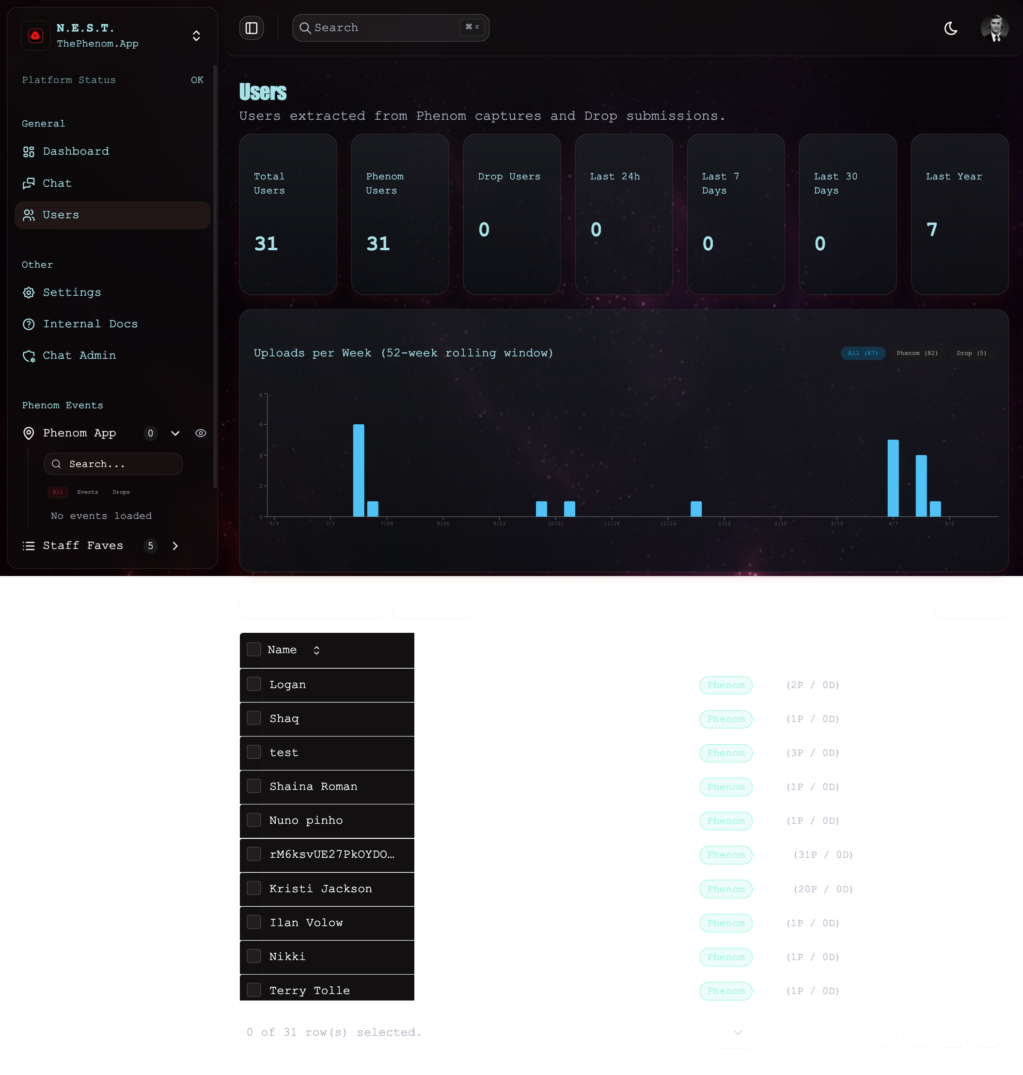
Statistics Cards
Seven cards displayed across the top of the page:
| Card | Description |
|---|---|
| Total Users | All unique users across both sources |
| Phenom Users | Users who submitted Phenom captures |
| Drop Users | Users who submitted Drops |
| Last 24h | New users in the past day (green text) |
| Last 7 Days | New users this week |
| Last 30 Days | New users this month |
| Last Year | New users this year |
Users Table
The table below the chart displays all known users with these columns:
| Column | Description |
|---|---|
| Select | Checkbox for bulk selection |
| Name | User’s display name |
| Email address | |
| Source | Badge showing “Phenom” (cyan) or “Drop” (amber) |
| Items | Total count with breakdown (e.g., “1 (1P / 0D)”) |
| Last Active | Most recent activity date |
Table Features: Search by email, filter by source, sort by column headers, pagination, show/hide columns via the View button.
14. User Stats & Analytics
The Uploads per Week chart is shown on the Users page between the stat cards and the user table.
Upload Chart
The chart shows a 52-week rolling window of uploads:
- Filter buttons: “All”, “Phenom”, “Drop” with counts in parentheses
- Active filter is highlighted in cyan
- Phenom bars are cyan, Drop bars are amber
- Click a bar to expand and see individual events for that week
- The expanded panel shows:
- Week label (“Week of 3/1”)
- Event count
- Each event with: source badge, username, country code, date
- Click any event to navigate to its marker on the dashboard
15. Global Search (Command Palette)
Press Cmd+K (Mac) or Ctrl+K (Windows/Linux) to open the global search command palette. The search icon and shortcut hint are visible in the top-right of every page (see dashboard screenshot).
What You Can Search
| Category | Searchable Fields |
|---|---|
| Markers | Filename, owner name, file hash, verification status, file type, location address |
| Navigation | Dashboard, Users, Settings, Help Center |
| Theme | Switch between Light and Dark mode |
Search Results
Each marker result shows:
- Label: Emoji + filename (Drops) or owner name (Phenoms) with “Drop” or “Phenom” prefix
- Details: Coordinates, address, file hash preview, timestamp
- Click a result to navigate directly to that marker on the map
16. Internal Docs
The Internal Docs page (sidebar: Other → Internal Docs) embeds this very documentation site inside N.E.S.T. – it iframes int-docs.matthewstevens.org through the nest-api Worker (which attaches a CF Access service token so the iframe is same-origin and not blocked).
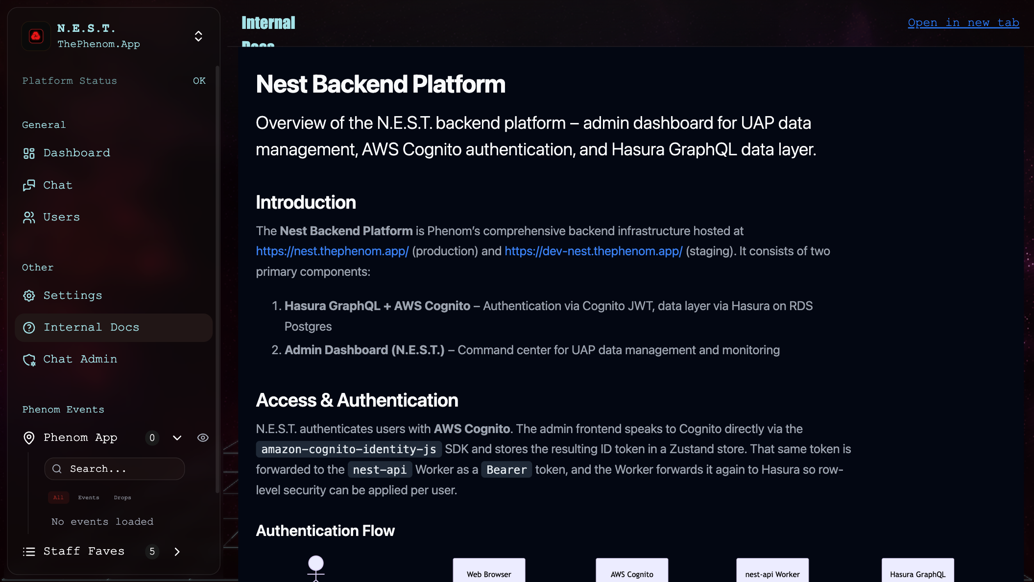
- Embedded docs: the full int-docs site, in an iframe, without leaving N.E.S.T.
- Open in new tab: the header link opens the docs in a separate tab.
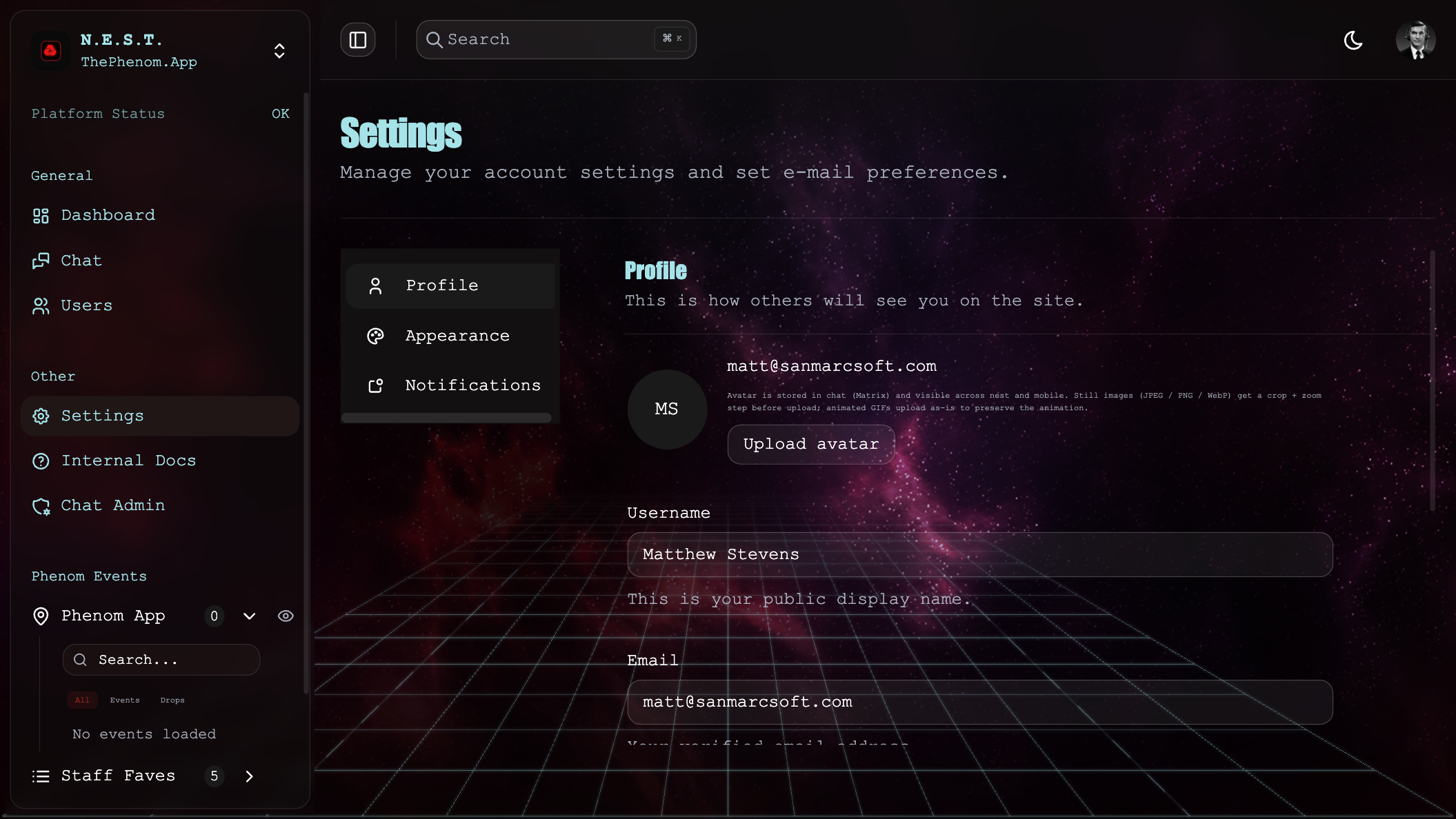
17. Settings
Access settings via the sidebar: Other → Settings or the user dropdown. The page has Profile, Appearance, and Notifications tabs (plus the Chat Connection card – see §19).
Appearance
| Control | What it does |
|---|---|
| Theme | Light / Dark |
| Font | Dashboard font family |
| Streetview – font size | Scale (0.75×–2×) for the Streetview HUD text (metrics + layer toggles) |
| Globe – font size | Scale for the globe’s VR-camera HUD text |
| Replay onboarding tour | Re-triggers the guided tour the next time you open the globe |
Profile Settings
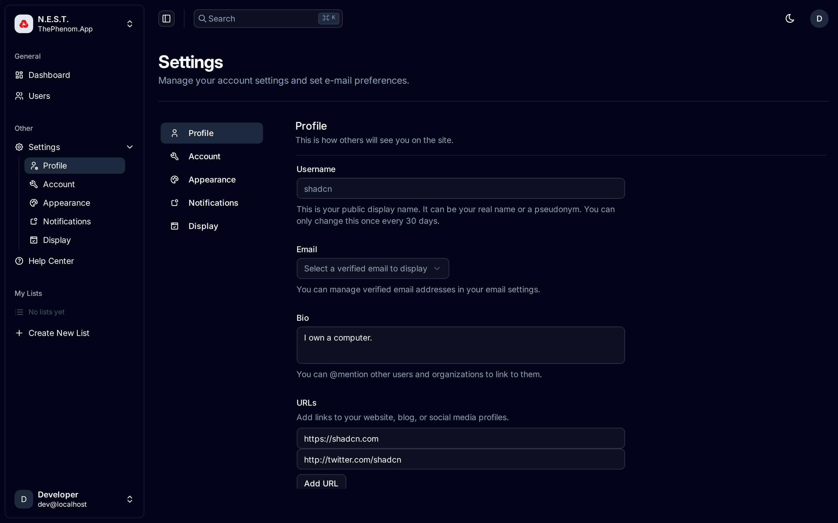
| Field | Description |
|---|---|
| Username | Your public display name. Read-only if synced from GitHub via Cloudflare Access |
| First / Last name | Composed into the display name sent to the API |
| Select from verified email addresses (read-only if GitHub-synced) | |
| Avatar | Upload from device (JPEG/PNG/WebP/GIF). Still images go through a crop + zoom dialog; animated GIFs upload as-is. Your avatar syncs to your chat identity across all N.E.S.T. surfaces |
| Bio | Short description (max 160 characters). Supports @mentions for linking other users |
| URLs | Add links to your website, blog, or social profiles. Click “Add URL” for more fields |
Public profile visibility
A sub-card toggles which fields appear on your public profile (what others see in chat): Username, Full Name, Links, Bio, and your Phenom-event count. The server enforces these — a field you switch off never leaves the API.
Display (sidebar items)
Settings → Display has checkboxes to show/hide top-level sidebar entries (Dashboard, Search, Chat, Users). Settings stays locked-on; preferences are saved per device.
Notification Settings
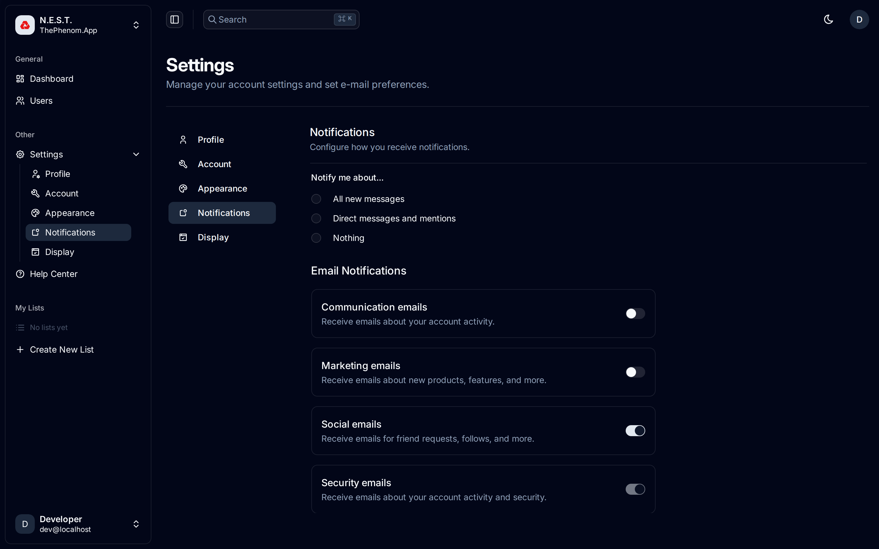
Chat notifications (radio buttons): All new messages · Direct messages and mentions · Nothing. Applies to the in-tab web notifier and mobile push.
List shares (toggle): be notified when someone shares a list with you.
Phenom event alerts (opt-in) — get notified about new Phenom events, scoped by:
| Control | Options |
|---|---|
| Enable | On / off for event alerts |
| Vicinity | Anywhere, or within 10–1000 km of your location |
| Event types | Tick UFO/UAP, Paranormal, Cryptids, Drones, Helicopters, Misc (all unticked = all types) |
| Specific users | Comma-separated usernames to follow (empty = all users) |
Push devices: your mobile devices register here to receive push (managed by the app). Location used for the vicinity filter is snapped to a ~2 km grid for privacy.
18. Messaging / Chats
Access via sidebar navigation if enabled in your display settings.
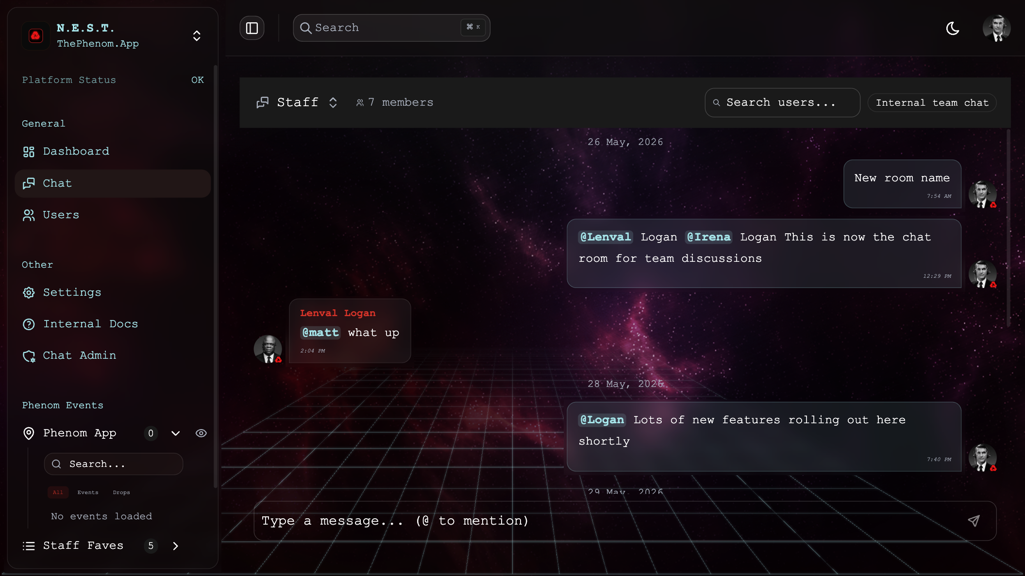
Features
| Feature | Description |
|---|---|
| Inbox | Searchable list of conversations |
| Message Thread | Messages grouped by date |
| Compose | Text input with send button |
| Attachments | Buttons for file/media attachments |
| Call Buttons | Video and phone call icons (UI present) |
| New Conversation | Dialog to start a new chat with team members |
19. Logging Out
How to Log Out
- Click your avatar in the bottom-left corner of the sidebar
- A dropdown menu appears showing your name, email, and shared content counts
- Click Log out for a standard Cognito sign-out
Chat session recovery
If your chat connection is broken (wrong MXID, stale Matrix state, “Chat authentication failed” messages):
- Sign out and reset chat – available in both the top-right avatar dropdown (on every feature page) and the bottom-left sidebar dropdown. Tears down the persisted Matrix client state (IndexedDB, localStorage, service-worker caches) before signing out of Cognito.
- Reconnect to chat – available on the Settings page (the default
/settingslanding). Rebuilds the Matrix session without signing out of N.E.S.T. Use this for a lighter recovery when you are still signed in and just need chat reconnected.
The Settings page also shows your current MXID, homeserver, and Synapse admin status in the Chat Connection card.
Quick Reference
Keyboard Shortcuts
| Shortcut | Action |
|---|---|
| Cmd/Ctrl + K | Open command palette (global search) |
Color Legend
| Color | Meaning |
|---|---|
| Cyan / Sky Blue | Phenom Event data, active toggle states, verified content |
| Amber / Orange | Phenom Drop data, unverified content |
| Magenta / Violet | AI-manipulated content detected |
| Green | Last 24h stats, positive indicators |
| Red | Drop list icon, delete actions, notification badges |
Navigation Map
Top navbar:  [☰ sidebar]  EVENTS ▾ (All / Events / Drops, grouped + Uncategorized)   ⌕ Search   ☼/☾   ⤢ Focus   (avatar)

Sidebar
├── General
│   ├── Dashboard (3D Globe)
│   ├── Search
│   ├── Chat
│   └── Users (management & analytics)
├── My Lists
│   ├── [Your Lists] (expandable; drag events in; share)
│   └── + Create New List
├── Shared Lists
│   └── [Lists shared with you] (originator avatar → click to chat)
├── Other
│   ├── Settings  (Profile · Appearance · Display · Notifications · Chat Connection)
│   ├── Internal Docs
│   └── Chat Admin (staff)        + INT: Ops, Linear
└── User Avatar (bottom-left)
    ├── Shared With Me (badge)
    ├── Notifications
    └── Log out / Sign out and reset chat

Globe overlay:  Realtime | Historical   ·   AIRCRAFT ▾ (type tickboxes)
Feedback
Was this page helpful?
Glad to hear it! Please tell us how we can improve.
Sorry to hear that. Please tell us how we can improve.